Team: 4 members | Completed: March, 2018
Overview
Dancing is an amazing way to self-express and self-reflect. However, many amateur dancers have difficulty receiving the proper feedback that they need to become better dancers. Sooner or later, this problem can lead to a lack of confidence when dancers are performing in front of other people. This is where the Spotlight application comes in. Spotlight focuses on three main components: feedback, community, and inspiration. Dancers that interact with our application are able to give and receive feedback on user uploaded dance videos. Our app aims to create a safe community for all dancers, and the user interface was created with our motives and the safety of our users in mind By logging into Spotlight, users can tune in with dancers around world and might stumble upon the inspiration that they need in order to become a more confident dancer.
Mobile Interface Mockups
|
|
|
|
Research |
|
Research Findings
Each member of our team conducted a user interview and a competitive analysis on products that would be competing with our app. When conducting our interviews, we tried to collect as much data as possible. The questions that we asked were geared towards finding out more about the lifestyles, goals/desires, motivations, pain points, and wants of amateur dancers. In order for us to gain insights from a diverse perspective, each member interviewed dancers at different levels of expertise.
To go beyond conducting interviews, our team observed dancers in a studio. This allowed us to find data that we did not think of asking about in our user interviews. Following our observations, we were able to ask those same dancers questions about what we observed to grasp key insights that we needed to know. Our research showed us that a huge issue within the dance community is receiving feedback when they are not in the presence of their dance teacher/choreographer. This data allowed us to create a product that can address this problem.
To go beyond conducting interviews, our team observed dancers in a studio. This allowed us to find data that we did not think of asking about in our user interviews. Following our observations, we were able to ask those same dancers questions about what we observed to grasp key insights that we needed to know. Our research showed us that a huge issue within the dance community is receiving feedback when they are not in the presence of their dance teacher/choreographer. This data allowed us to create a product that can address this problem.
Personas
After compiling the information from our user research/interviews, we wanted to create a realistic representation of our target users. We worked together to gather information, and we brainstormed what a user of our app would want and need. Based on our independent user interviews, we collaborated to organize commonalities that we found amongst our users.
Next, we created two provisional personas. Originally, we wanted to create two amateur dancers for our persona. However, some of our interviewees were professional dancers, so we decided to create an amateur dancer and a professional dancer persona. We quickly learned that we needed to diversify our target audience so that our application can be useful to a broader scope of dancers. Our user personas helped us keep in mind what our users goals, pains, and desires were throughout the entire design process.
Next, we created two provisional personas. Originally, we wanted to create two amateur dancers for our persona. However, some of our interviewees were professional dancers, so we decided to create an amateur dancer and a professional dancer persona. We quickly learned that we needed to diversify our target audience so that our application can be useful to a broader scope of dancers. Our user personas helped us keep in mind what our users goals, pains, and desires were throughout the entire design process.
|
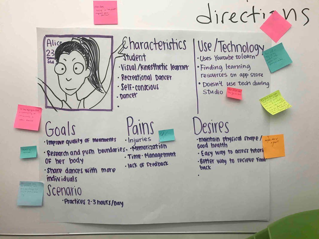
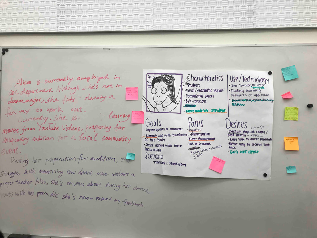
The user personas that we made, highlighting characteristics and pain points of a typical person from the target audience of Spotlight
|
|
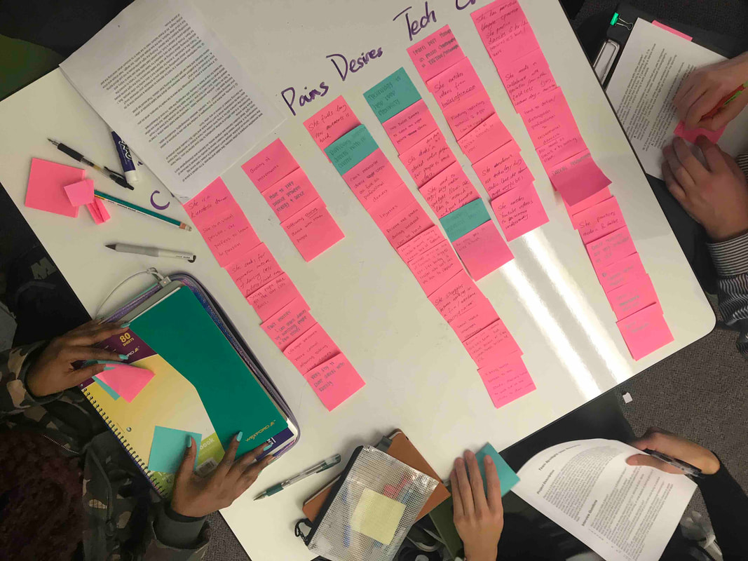
Additional photos showing our brainstorming and ideation that lead up to our user personas
|
User Journey Map
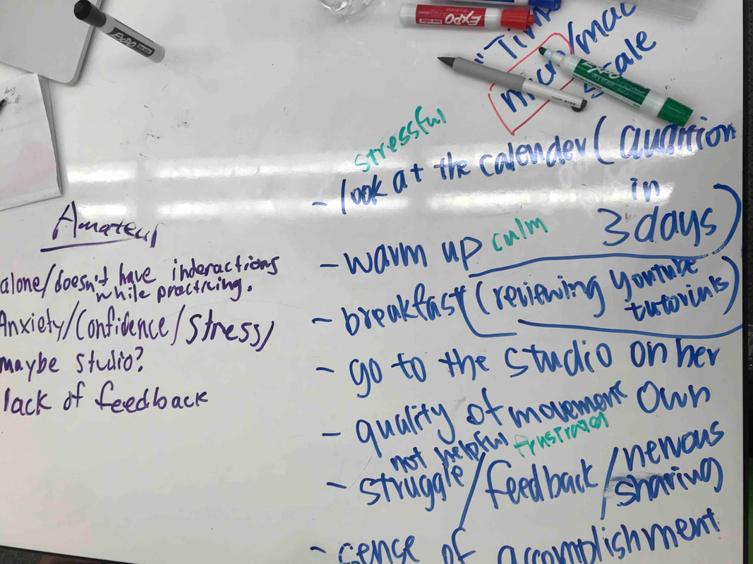
Our team created a user journey map because we wanted to visualize what a day in the life of a user like Terry might look like. We focused on the times before, during, and after Terry practiced dancing in a studio because we realized that our app will affect users even when they are not using it. From our research, we learned that dancers typically feel confident when they are dancing well, and anxious when they are not dancing as well as they want to be. We wanted to see how these two emotions might change over the course of a day. By creating this user journey map we placed ourselves in the position of our users, which allowed us to design from a more empathetic point of view. We used this user journey map to start identifying some of the functions and requirements that we wanted to include in our design.
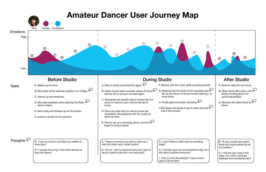
User journey map depicting a day in the life of, and the emotions felt by the user persona that we created
|
Design Requirements
In order to identify some of the key functionalities of our app, our team created a list of design requirements. In creating this list, we picked out about 10 functions that we wanted to include on our platform, and we determined what sort of interactions and contexts would be needed in order to support the identified functions. Below is a list of some of the more prominent design requirements that our team identified.
- Allow users to feel safe when sharing their dances.
- Allow users to educate, learn, and share original choreography.
- Allow users to track their progress.
- Allow users to give and receive feedback.
|
|
Design |
|
Storyboards
When creating our storyboards, we tried to contextualize some of our most fundamental design requirements. When creating our storyboards, we focused on topics such as enhancing memorization, seeking inspiration, and tracking progress. Keeping those themes in mind, we were able to come up with narrative stories about how a user might interact with these features of our application. This was our first attempt to examine how we can use technology to solve some of the problems that amateur dancers face.
|
The initial storyboards that our team created
|
Information Architecture
After brainstorming about different scenarios about how users will interact with our application, our team tried to narrow down some possible locations that users might find themselves at. Since our goal was to make dancers better dancers, we wanted to draw more focus on the user flow of giving and receiving critiques. We thought to ourselves, how can we find a balance between the privacy of our users and at the same time allow them to get more constructive feedback? How can we encourage and motivate reviewers to give critiques to other dancers? That is why we want to guide our users to do one action per page. For example, while at the home feed page, users can view dance videos for inspiration. From the critique page, users can critique specific dance videos or dance videos that are recommended by our app. We also wanted to allow users the ability to choose the audiences that are going to see their dance videos. By customizing the categorization and privacy settings for their dance videos, users can feel safe and more receptive to receiving constructive feedback. This Information Architecture diagram was the backbone of our entire project, and allowed us to create a platform that facilitates meaningful interactions.
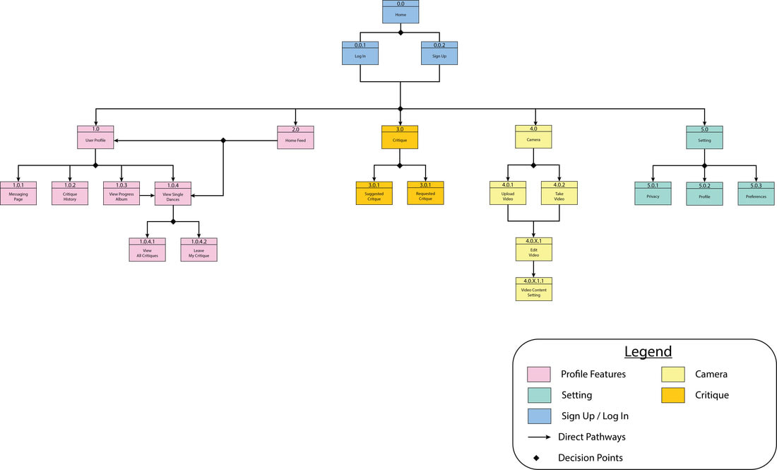
Information architecture that outlines the structure and hierarchy of Spotlight
|
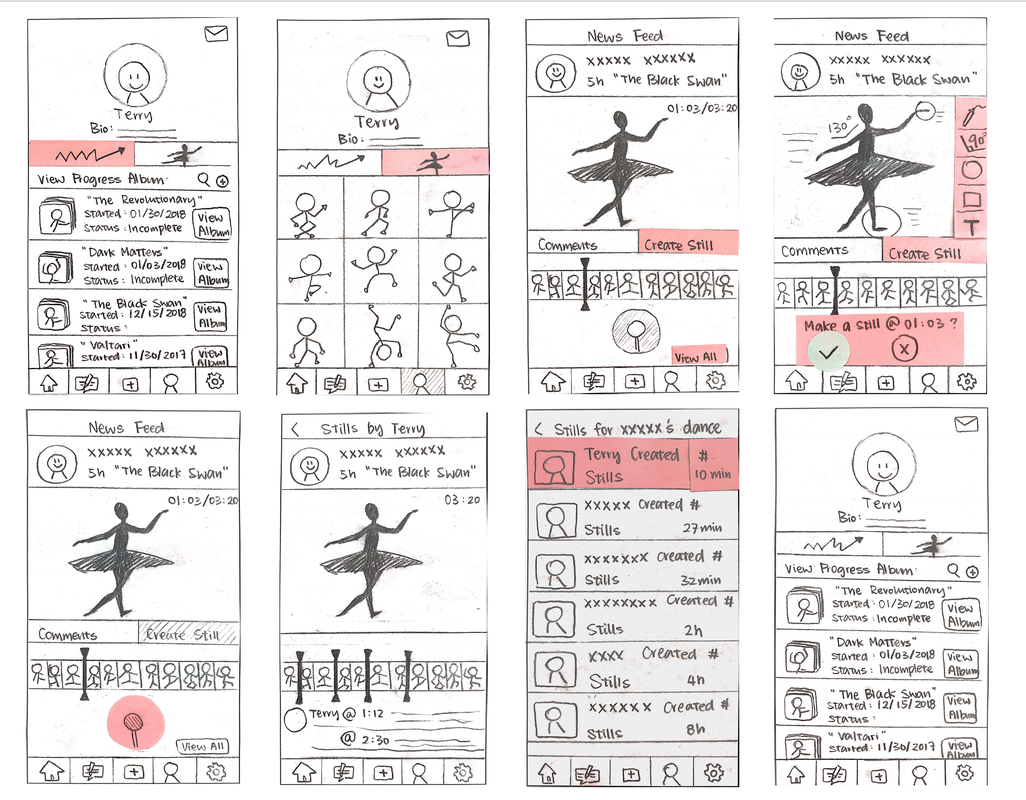
Paper Prototypes
Task 1: Uploading a Dance Video
In this task, the user can either upload a pre-existing dance video from their localized camera roll or record a new video of their choreography. The user can then edit and customize their video by using the tool bar before they click upload. They can add their own personal title and description, categorize their dance, and can choose who can view their uploaded video.
In this task, the user can either upload a pre-existing dance video from their localized camera roll or record a new video of their choreography. The user can then edit and customize their video by using the tool bar before they click upload. They can add their own personal title and description, categorize their dance, and can choose who can view their uploaded video.
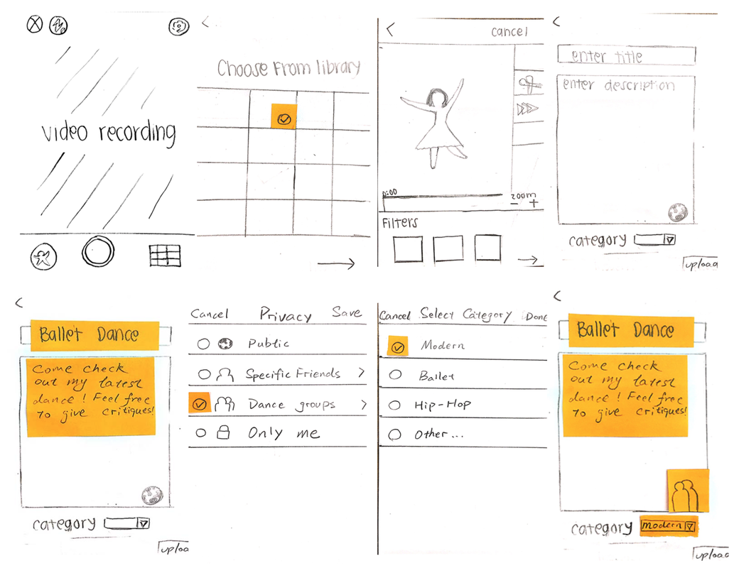
Paper Prototypes depicting the screens involved with the photo capturing and uploading sequence.
|
Task 2: Creating a Progress Album
In this task, we want the user to track the progress of their dance moves. By creating a “Progress Album”, the user can group together videos of the same dance that they have been practicing. With this newly created progress album, the user can observe the progress that they have made on a certain dance over time.
In this task, we want the user to track the progress of their dance moves. By creating a “Progress Album”, the user can group together videos of the same dance that they have been practicing. With this newly created progress album, the user can observe the progress that they have made on a certain dance over time.
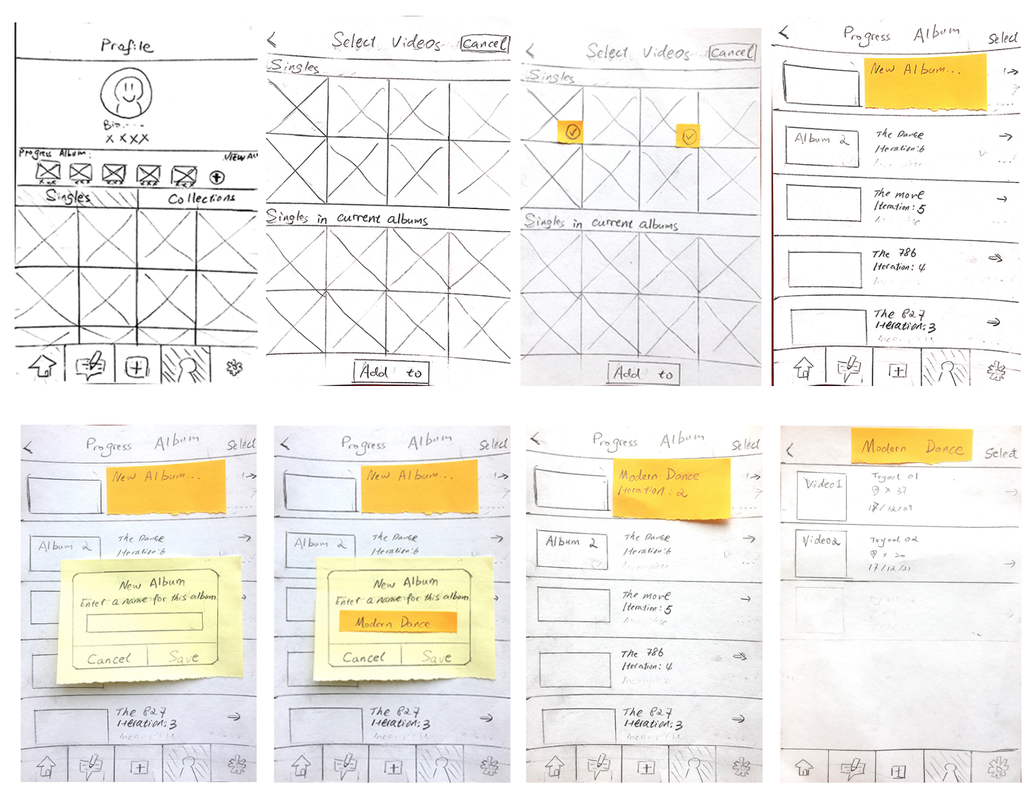
Paper prototypes depicting the screens involved in the "creating an album" flow
|
Task 3: Creating a Critique
Leaving a critique allows the user to provide feedbacks to other dancers by selecting a specific frame of the video and leaving a detailed critique. The user can either write with text or can use tools to draw annotations on the videos of other users.
Leaving a critique allows the user to provide feedbacks to other dancers by selecting a specific frame of the video and leaving a detailed critique. The user can either write with text or can use tools to draw annotations on the videos of other users.
|
|
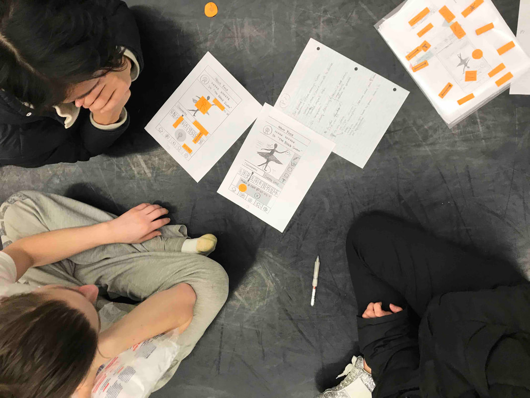
Paper prototypes depicting the screens involved in the "Leaving Feedback" process
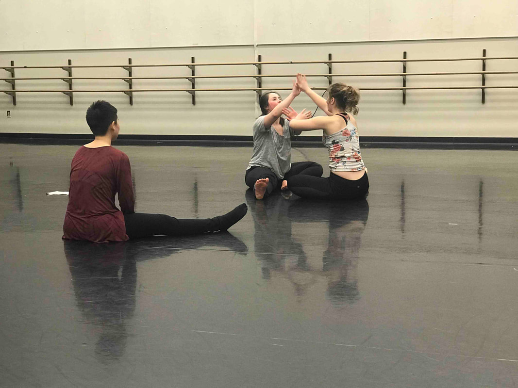
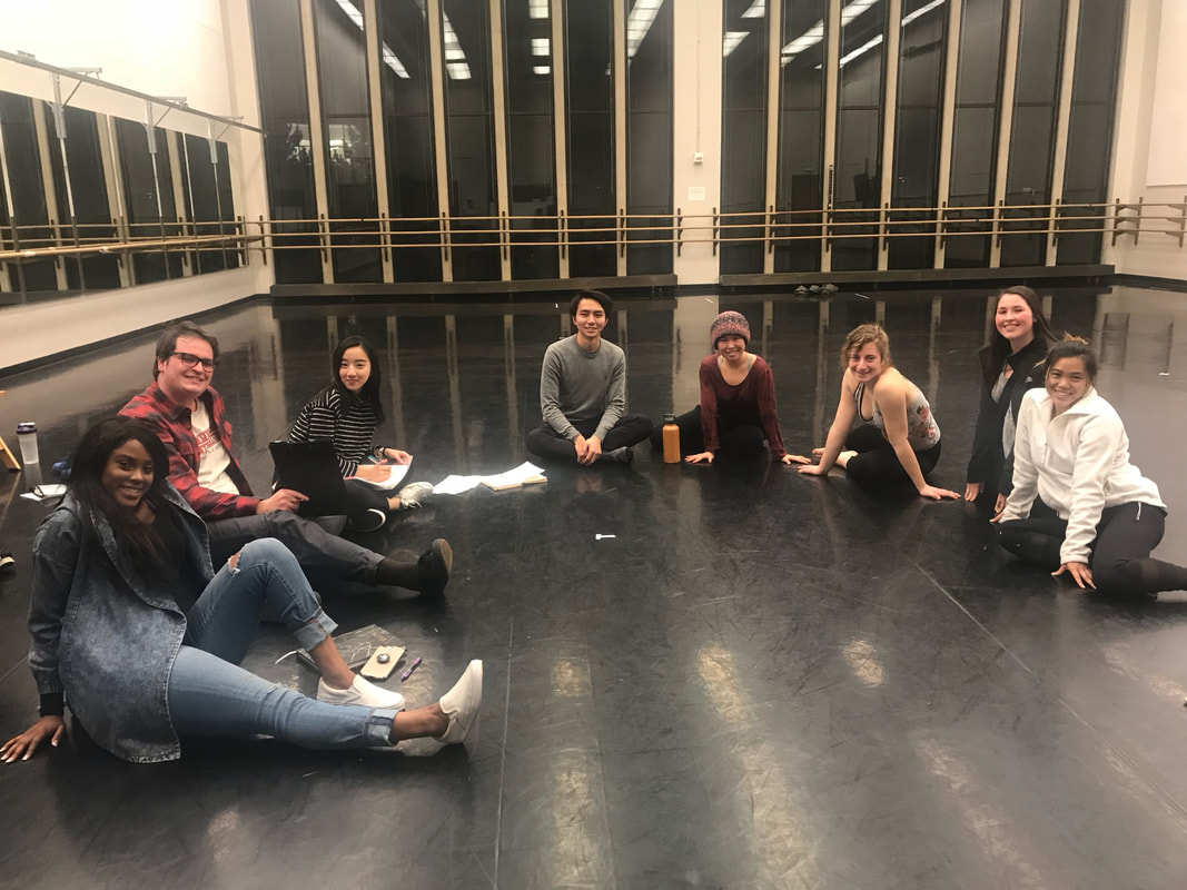
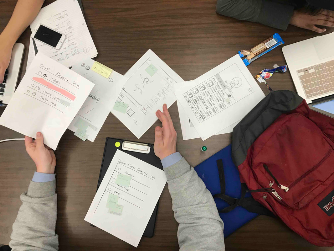
Photos from our observation and paper prototyping sessions
|
Quick Evaluation Findings
In order to identify the strong and weak points of our designs, we conducted usability testing on our paper prototypes. We observed three different dancers interact with our prototypes in order to gain a better understanding of how amateur dancers will interact with our app. This helped us identify the flaws with our overall user interfaces. We wanted to focus specifically on the legibility of our icons and the layout of our overall interfaces. Following our observations, we learned what our intended users enjoyed about our design, and what could be improved.
This information helped us prioritize the functionality of our app. Many of the dancers asked us questions that we never thought to ask ourselves. These fresh perspectives allowed us to focus in on the broad goals of our app, and how we can support those goals with the small details of our interface. The things that we learned from usability testing helped us reevaluate some of the elements of our design, and we implement these revisions in our high-fidelity wireframes.
This information helped us prioritize the functionality of our app. Many of the dancers asked us questions that we never thought to ask ourselves. These fresh perspectives allowed us to focus in on the broad goals of our app, and how we can support those goals with the small details of our interface. The things that we learned from usability testing helped us reevaluate some of the elements of our design, and we implement these revisions in our high-fidelity wireframes.
Annotated Wireframes
We took our findings from the usability testing on our paper prototypes and created an annotated wireframe for our app. Our main reasons for doing this were to fix the problems that were identified during usability testing, and also to establish a general user interface. We wanted to highlight the key functions on each page of our app, while also testing out the readability of our icons. We then took these wireframes back to the user testing stage, and used the feedback from those sessions to create our high-fidelity mockups.
|
Annotated wireframes of the Spotlight application
|
High Fidelity Mock-Up
The final step of our design process was to create high fidelity mock-ups of several interfaces for our key path scenarios. By summarizing the critiques we received on our annotated wireframes, we selected several key interfaces from our wireframes and designed an initial set of high fidelity mockups. After reviewing the critiques we received from our peers and judges, we revised our app to form a community between two types of users: the amateur dancers who are seeking feedback, and the reviewers who are offering feedback. We implemented a “clap” feature that allows other users to show approval or appreciation for a specific piece of critique. In the critique page, each “critique pin” stands for a piece of feedback that a reviewer typed out. Also, a reviewer can use the tool bar to draw attention towards focal points and specific parts of a movement. When a user is viewing the feedback given to him/her, the video will pause at that frame. This allows the user to not only digest the feedback that they receive, but to act upon it.
|
|
|
|
Reflection |
|
After working on this project for 10 weeks, our team gained a number of valuable insights. We found that user interviews and user observations are very helpful. These relatively casual encounters with our users often gave us the most valuable information. For instance, during our user observations, one of the dancers told us that the same movements translate differently to different dancers. This seems like a fairly obvious statement, but it had never crossed any of our minds. We tried to prioritize information that we gathered directly from our users in the design of our app.
Our team also found it challenging to not make assumptions when we were designing and prototyping our app. In the beginning of our design process, we made the assumption that we would have to track the motions of our users. However, after conducting user research and talking to some dancers, we found that receiving proper feedback was a larger priority for dancers than simply just tracking a their motions with wearables. We also learned that the design process is not linear. It requires iteration: going back to past works that have been completed, revising them, and using those revisions to move forward with the design.
Having only 10 weeks to make this app from start to finish, we realize the limitations of our final mock-ups. If we had more time to complete this project, we would focus more on how we would incentivize users to actually create feedback and give critique to the dancers who would be using our app. We focussed too much on the users who would be expecting feedback from other users, but we did not focus much on how we would get the users who leave feedback onto our app. We would also conduct more user interviews on professional dancers. Our app targets amateur dancers, so that is who we interviewed, but it would be nice to have a more diverse understanding of dancer’s wants and needs.
