Team: 2 members | Date Completed: June, 2019
Overview
GreenEats is a web application that allows users to browse and modify recipes based off their ecological impacts.
The audience of our website are people who like to cook food, use online food tools, and care about food's impact on the environment (to varying degrees).
The purpose of our website is to encourage people to factor in the environmental impact (carbon footprint, water footprint, other metrics) of the food they are consuming when purchasing groceries, selecting recipes, cooking meals, or eating out. We want people to value their foods’ environmental impact just as they would value cost, access, and taste in their decision making process. By comparing foods using an environmental metric, generating actionable suggestions, and raising awareness we hope to motivate our audience to make more environmentally-conscious food decisions.
Preview: Mobile Prototype
My teammate and I used Figma to created an interactive prototype detailing the final GreenEats mobile experience. The prototype that is linked below is interactive, so feel free to click around!
|
|
Research |
|
My Role
During the research stage our our project, I pitched the idea that our website be focussed on the ecological impact of food. I also performed a competitive analysis, and I conducted two user interviews which included writing research questions, organizing interview sessions, taking notes, note transcription and data qualification. During the research synthesis stage, I organized and lead the affinity diagramming session, and produced the preliminary characteristics and pain points of our user persona.
Problem Scoping
When we first started doing research into the ecological impact of certain foods, we could hardly find any information. The graph below summarizes the gist of the information that we were able to find.
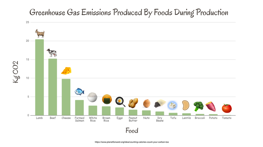
Graph found online depicting the general CO2 emissions of different food groups (Source).
|
It is commonly know, as the graph corroborates, that meat is bad for the environment and veggies are good for the environment. If somebody wants to be more conscious about their food's impact on the environment, they are generally advised to make a huge change to their diet by becoming vegetarian or vegan. What we wanted to provide was a less drastic method of being mindful about your ecological footprint. Our goal when creating GreenEats was to provide people with a more granular, case-by-case method of reducing the ecological impact of the foods they are eating. GreenEats provides an immediate solution to reducing an individual's CO2 production by offering customizable, eco-friendly recipes without the need to completely alter their existing diet.
Competitive Analysis
Before conducting any research, my teammate and I conducted competitive analyses on two existing websites that dealt with the same problem space as our website. We conducted these analyses to understand the context of our problem space, and to get a feel for the environment that our website will exist in. We also wanted to identify the aspects that these websites did well, and also the aspects that could be improved upon. The two websites that we analyzed were eco-friendly blogs that discuss the issues and possible solutions surrounding wasteful food production and consumption.
Website 1: https://foodprint.org/
This is an informational website run by a non-profit organization that is dedicated to educating people about the environmental impact of the food that they consume. The website has links to various calculators that measure people’s food impact by having users fill out a three to five minute quizzes. The website also offers links to articles about current issues relating to food sustainability, as well as guides to shopping, dining, and eating sustainably.
Impact on Our Website's Content
While this website provides useful tools for evaluating one’s general food behaviors, it fails to provide guidance for more immediate food related decisions. By contrast, our website will offer a more case-by-case intervention by allowing users to evaluate specific recipes, products, meals, etc. It will also feature more actionable interactions by suggesting environmentally friendly alternatives.
Website 2: http://www.greeneatz.com/foods-carbon-footprint.html
Green Eatz is an online forum / blog spot where environmentally conscious readers can go to learn about the environment and healthy, sustainable eating habits. The linked blog post is talking about the CO2 emissions of common food groups and makes a number of actionable recommendations for readers to decrease the CO2 produced by their food. Although many of the suggestions are valid, the website offers no method of interaction - no way for the readers to calculate the actual CO2 emissions that their foods are causing. The website is dominated by inconsistent spacing, uncentered content, and a sidebar that is lost as you scroll through the page.
Impact on Our Website's Content
Despite the design flaws of the Green Eatz website, it provided some valuable insights regarding the design and content of a website oriented around sustainable eating. The main flaw that we found with Green Eatz was the lack of information about the user’s CO2 emissions offered by the website. We want to prioritize providing people with actual insights into their diets and how they impact the environment, because we feel that this is the best way to make people more conscious about their food choices. We also want to create a simple, yet visually pleasing website design. We want to focus users on the data we are providing them without distracting them with uneven spacing or over flashy animations.
Research Questions
Our project, and subsequently our research, aims to encourage people to factor in the environmental impact (carbon footprint, water footprint, other metrics) of the food they are consuming when searching for recipes to cook. Before speaking to users, we defined five questions that we sought to answer over the course of our research. These questions lead us through the research stage of our project and I constantly referenced back to them when designing, conducting, and analysis research studies. Our research questions were:
- How do people choose what food to cook?
- Why do people cook?
- What, if at all, do people think about the environmental impacts of their food?
- What are the limitations to people's current method of finding something to cook?
- What are the criterion that people consider when finding a recipe to cook?
User Interviews
During the early stages of research, I conducted two user interview sessions in order to discover the processes that a typical student goes through when cooking food. I focused on asking about the times when participants browse for a recipe, and tried to uncover their behaviors before and during the process. Both participants were college students, one who cooks food at home often, and another who does not cook food at home often. I wanted to get an understanding of both user groups, to see how our product might be able to appeal to both people who like to cook, and to those who don't. After taking notes during both interviews, I transcribed the notes and lead a session with my teammate to annotate and qualify the data, highlighting salient points that we used for affinity diagramming later on.
|
|
Key Takeaways
- Price is a big factor when participants are searching for recipes or ingredients to cook. Often times, the meal that a person makes is dictated by the price of the ingredients.
- Some people don't like to cook at home because they don't have the time or energy.
- Environmental impact of food is important to participants, but often is not at the forefront of consideration when searching for recipes to eat.
Observational Study
While I was conducting user interviews, my teammate conducted an observational study which concluded in a short interview with the participants. The subjects of the study were two college students who cook for themselves and value cooking as an important activity in their lives. During the study, we focussed on understanding three aspects of the cooking process. Understanding these focus areas helped us identify the habits and specific preferences of our users that our website had to conform too. These three focus areas were:
- What technology the participant uses to find recipes.
- How the participant uses the recipe throughout grocery shopping and cooking.
- Behaviors for selecting and substituting ingredients.
|
Key Takeaways
- Participants reference an online recipe while they are shopping for ingredients and while cooking, often from a mobile phone.
- Participants are comfortable with substituting certain ingredients for others in a recipe found online.
Affinity Diagram
After completing the research stage of our project, I wanted to create an affinity diagram using our synthesized research notes in order to further classify our findings. During affinity diagramming, we separated our qualified data points into three different overarching categories: Recipe Selection, Recipe Making, and Technology Use. I assisted with creating the categories on our diagram, and my teammate and I collaboratively placed data points into each category while indicating which study the data point originated from. The diagram allowed us to summarize and consolidate our research findings into one concise document, and it assisted with the user persona stage of our research synthesis. Below is a digitized version of our affinity diagramming session.
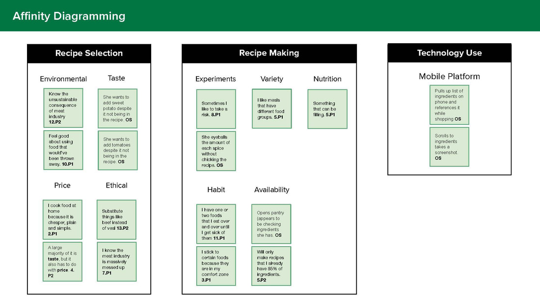
Digitized affinity diagram that classifies the salient findings and data points from our research.
|
Key Takeaways
- Participants prioritize price of ingredients when picking a recipe for dinner.
- Participants are comfortable substituting ingredients in a recipe.
- Participants care about the environmental impacts of food on some level.
- Participants often reference a recipe when shopping.
User Persona
I thought it was important to create a user persona because they are a great way to summarize the user group that we were designing for. I also think personas are a powerful UX tool because they help keep the end user and their needs in mind at all times, and serve as a great memory aid that can be referenced at any stage of the design process. While referencing the affinity diagram that we created, I started making a list of characteristics/values and pain points that a user of our website might have. These lists were founded in the research that we conducted with users, and I only included characteristics and pain points that were indicated from participant responses/observations.
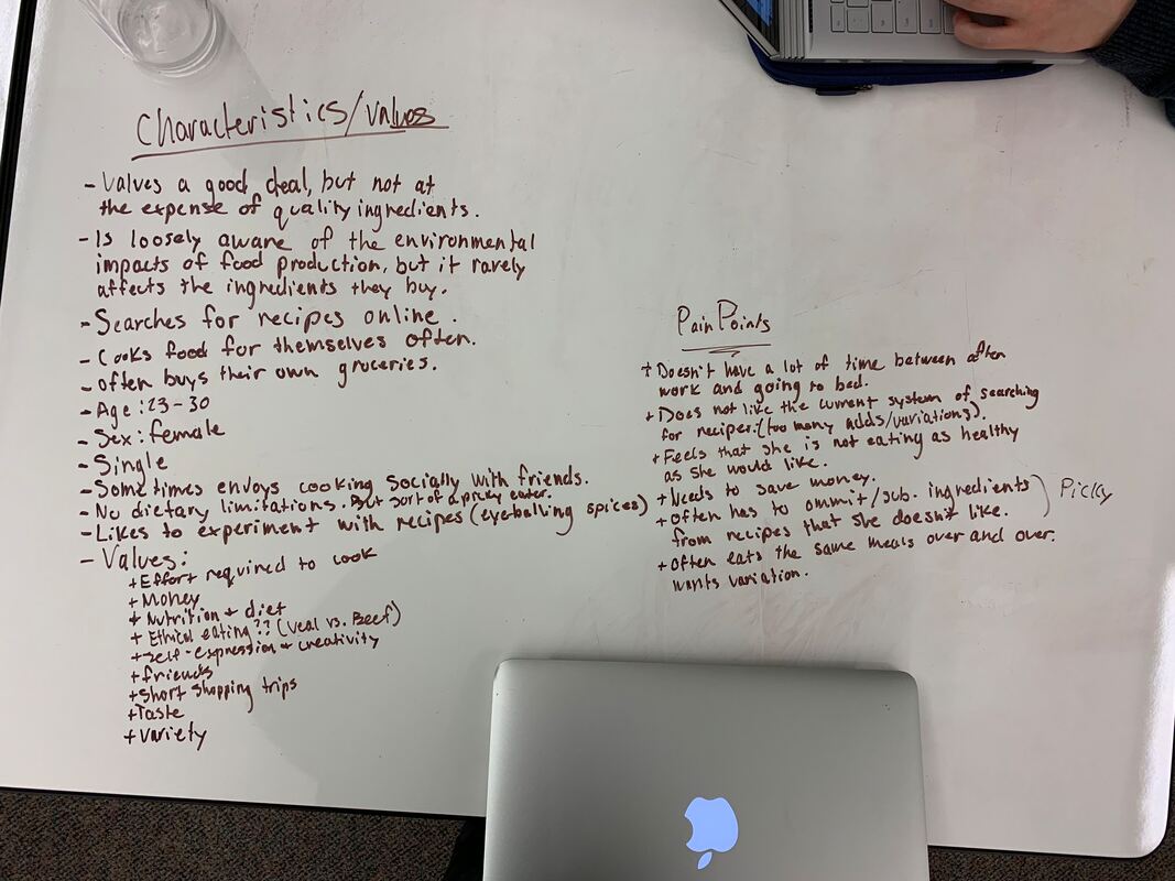
Our brainstorming while creating a user persona for GreenEats. Not all bullets were included in our final persona.
|
Creating this user persona helped me further understand the needs, behaviors, experiences, and goals of the users that we were designing for. We decided to characterize our persona as a college student/recent graduate, because all of the participants of our research studies belonged to this demographic. After creating a lengthy list of the possible characteristics, my teammate and I created a refined, easy to interpret user persona that we could reference easily throughout the rest of the project.
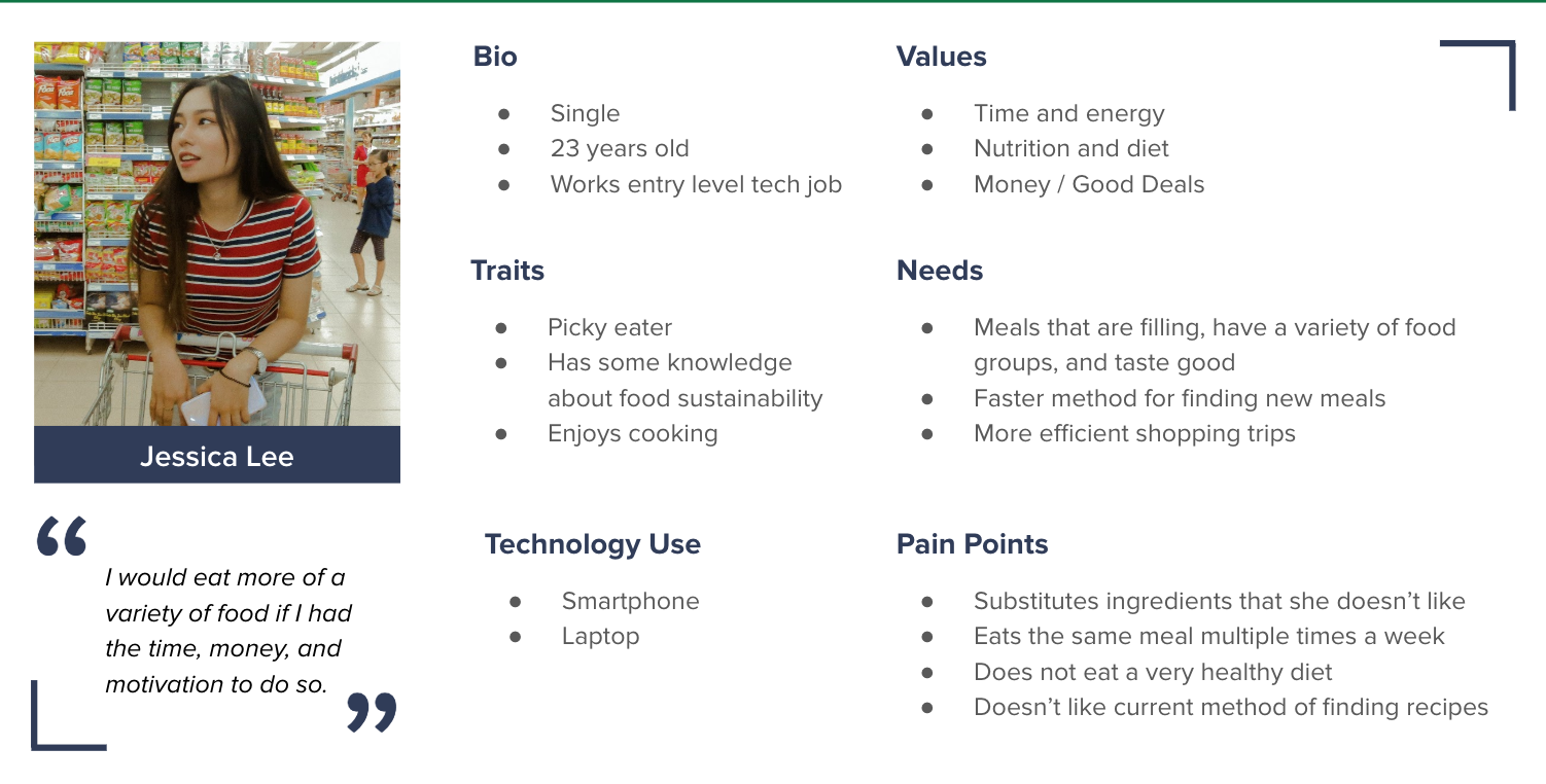
User persona that generalizes the user group that we were targeting with GreenEats.
|
|
|
Design |
|
My Role
During the design stage of our project, I drew an initial sketch depicting a possible user interface for our website. I assisted my teammate in creating an information architecture, and was responsible for referencing our research and affinity diagram to create the categories and pages. I also used Figma to design the landing page and the results page(s) wireframes and collaborated with my teammate to design the recipe page and ingredient substitution wireframes. I created a preliminary user flow, pitched it to my teammate, and assisted with creating a revised, digitized version. Additionally, I helped plan the card sorting sessions, and I created a digital wire flow of our mockups to offer context and a detailed view of user interactions and pathways. Lastly, I created one of the two versions of our preliminary high fidelity mockups that were later used for A/B testing.
Ideation
To begin the design stage of our project, my teammate and I each individually created a sketch of what a potential user interface could look like for a web-based recipe searching tool. These sketches allowed us easily express our ideas to each other without demanding too much time. Although the layout of the sketches looks similar, the content being presented differs greatly. My approach was to include specific data points about the CO2 produced and the water consumed to create a certain recipe. I also thought it would be interesting to include a biography of the farmer responsible for growing the ingredients required by the recipe. Unfortunately, after more research, I found that most of this information is not made publicly available, and could not be easily integrated into a website. My teammate took a different approach, and decided to pursue an abstract representation of the ecologic impact of the recipe. Recipes would be rated on a scale of 0-100, which would require us to create a classification algorithm. Our final interface ended up taking inspiration from both sketches.
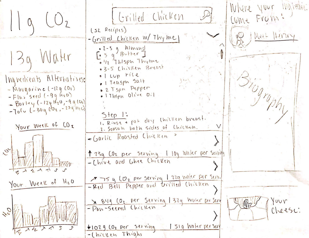
My initial sketch of a recipe searching user interface.
|
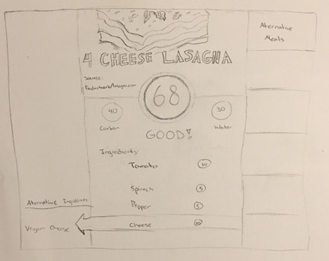
My teammate's initial sketch of a recipe searching user interface.
|
Information Architecture (First Iteration)
The next step in our design process was to create an information architecture (I.A. for short). I use I.A.s as a way to organize and structure the pages and content of a website, and they serve as a map during the prototyping and coding stages of a project. We created this I.A. as an effective way to get feedback on the flow of our website - to make sure that the layout was logical and made sense to users. I assisted my teammate in creating the I.A. shown below, and was responsible for referencing our research and affinity diagram to create the listed categories. After creating the I.A., l wanted to touch-base with our users again. We used our I.A. to create a number of cards and categories, and conducted three card sorting sessions to validate the layout of our website thus far.
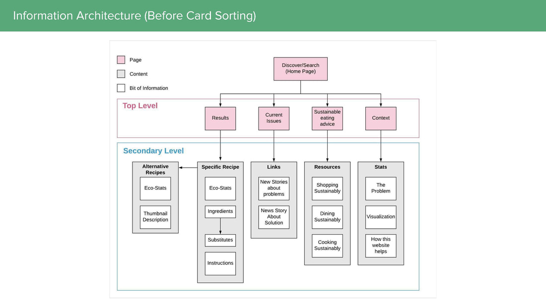
First iteration of our information architecture that describes the layout and flow of our website.
|
Card Sorting
My teammate and I conducted three card sorting activities in order to assess the effectiveness of our information architecture. I was adamant about getting feedback at this point in the project, because it was important to ensure that our design was still on track to meeting the needs and wants of our users. These card sorting sessions also allowed us to check that the categories, navigation, and tabs of our website were logical and easy to comprehend.
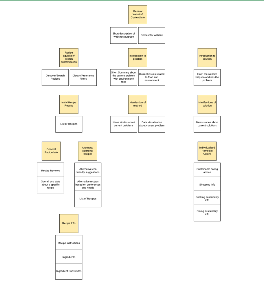
Digitized version of participant's final sorted cards.
|
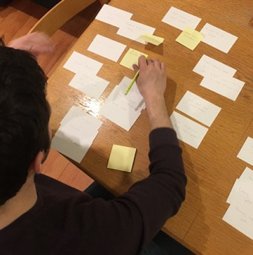
Photo of a participant from our card sorting activity.
|
We learned from these sessions that our participants did not see the need for a "current issues" page and a "sustainable eating advice" page. Instead, participants organized contextual information into two categories: information about the problem and solutions that address the problem. We reflected our findings from the card sorting activities into a revised information architecture, which can be seen below. The revised I.A. outlines a more comprehensive structure that our website would have been lacking if it were not for iterative user testing and design.
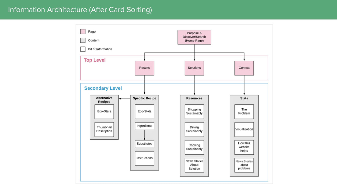
Revised information architecture that reflects our findings from the card sorting activity.
|
Wireframes
After validating our information architecture, my teammate and I used Figma to design low fidelity wireframes. I designed the landing page and the results pages, and my teammate and I collaborated on the recipe page and ingredient substitution UI.
I wanted to start by creating the mobile wireframes, because we employed a "mobile-first" design approach. Our research told us that participants typically reference recipes from a mobile device, both while shopping for ingredients and also while cooking. A mobile-first approach allowed us to focus our interface and future user testing on this research-supported use case. We also designed the mobile interface first because we felt that it would be easier to scale a mobile interface to a desktop rather than vice-versa. I placed a lot of emphasis on creating a responsive website that can be accessed from all devices, and mobile-first designing helped a lot with the process.
I wanted to start by creating the mobile wireframes, because we employed a "mobile-first" design approach. Our research told us that participants typically reference recipes from a mobile device, both while shopping for ingredients and also while cooking. A mobile-first approach allowed us to focus our interface and future user testing on this research-supported use case. We also designed the mobile interface first because we felt that it would be easier to scale a mobile interface to a desktop rather than vice-versa. I placed a lot of emphasis on creating a responsive website that can be accessed from all devices, and mobile-first designing helped a lot with the process.
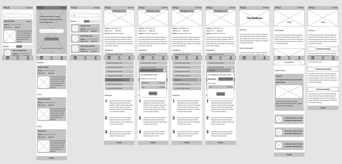
Initial wireframes of the GreenEats mobile user interface, used to get feedback on designs before writing any code.
|
User Flow
Although our wireframes allowed us to define the user interface of GreenEats, they did not adequately address the interactions that a user will have with our website. In order to understand the decision points and the possible pathways that a user can take through our website, I created a user flow. I sat down at a whiteboard, and with our wireframes in hand I created a preliminary user flow diagram, shown below. The ovals represent buttons or clickable artifacts, the squares indicate a new webpage, and the points at which user's make a decision are represented by a diamond.
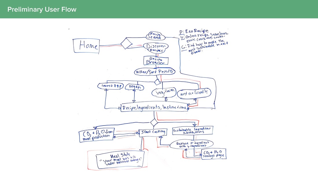
Preliminary user flow. This was our first attempt at describing the pathways and decision points that a user will have when using our website.
|
After consulting with my teammate, we created a digitized version of our user flow that addressed some of short-comings of my preliminary sketch. Our revised user flow includes toolbar interactions, which can be accessed from anywhere. We also made the labeling and direction of flow more legible, which proved useful during peer feedback sessions and project presentations. This user flow had the biggest impact on our design process during the prototyping phase. My teammate and I had a printout of the user flow show below, and we regularly referenced it while creating our interactive prototype.
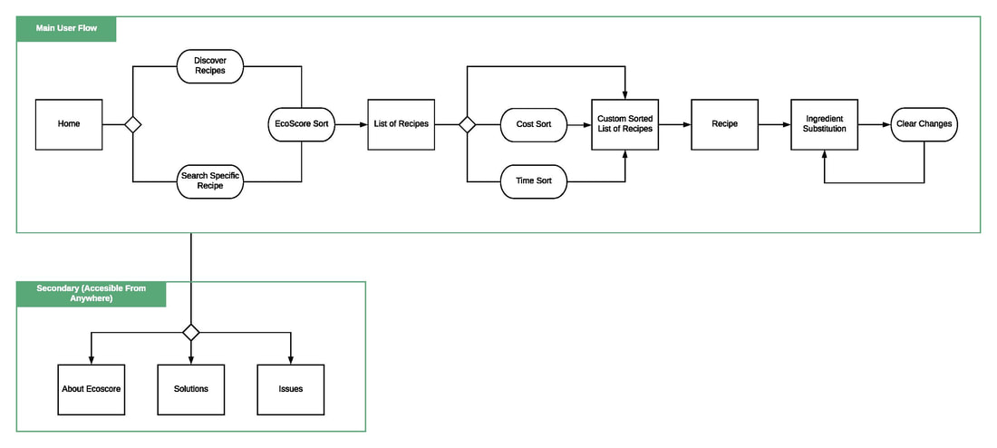
Revised User flow that better represents the decision points in the interaction flow of our website.
|
Interaction Wire Flow
I was happy with the user flow that my teammate and I created, but I wanted to get more specific. I wanted to provide more context around each interaction, and how they related to specific elements of our UI.
"What is this screen?"
"How would a user get from this screen to that screen?"
In order to answer questions like the ones listed above, I created a wire flow (a combination of a wireframe and a user flow). I placed our wireframes into categories to provide context to viewers which, when compared to viewing a row of wireframes, offers a more comprehensive summary of our user interface. I also added an additional metric (color) to afford a granular understanding of the interactions that users can have, and how these interactions lead to new content.
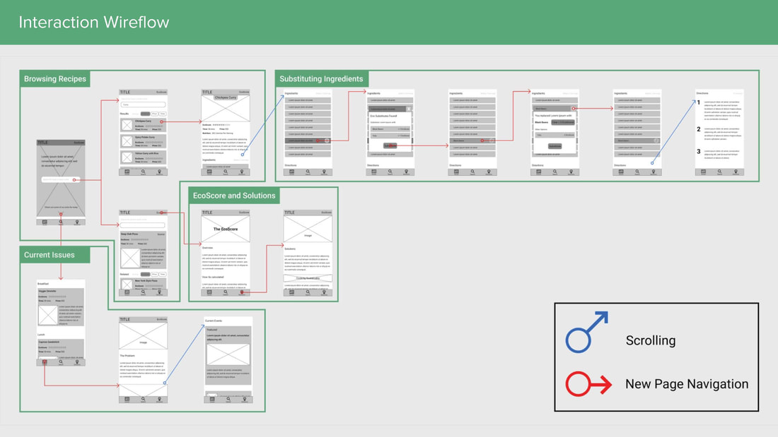
Wire flow that links specific interface elements to interactions and pathways that users can take.
|
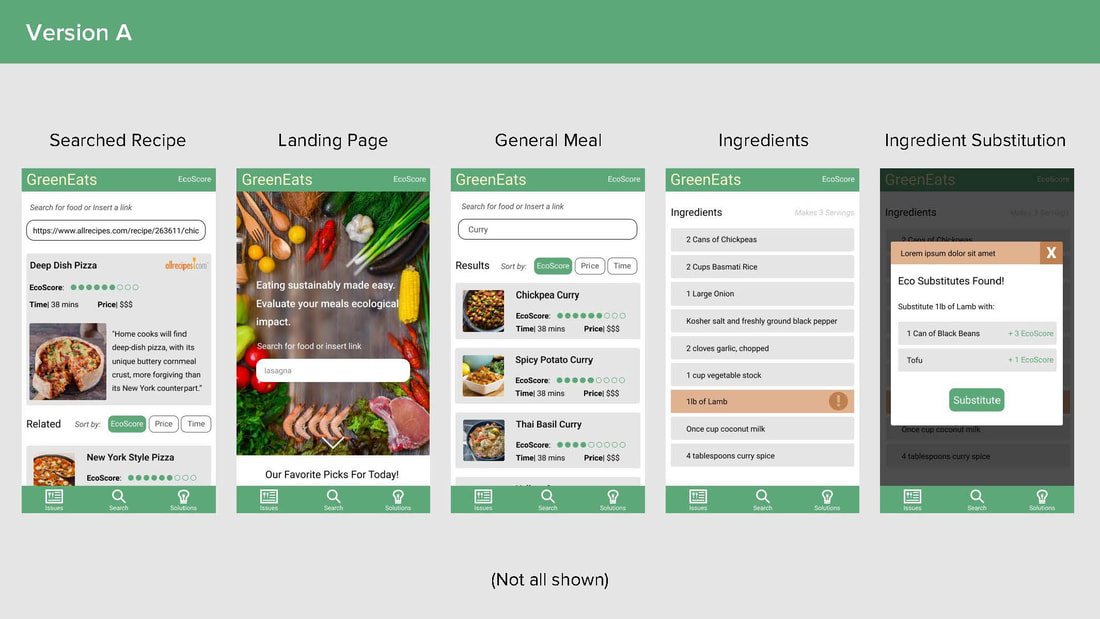
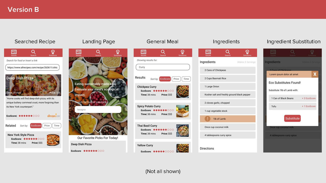
High Fidelity Mockups (First Iteration)
After creating low fidelity wireframes, information architectures, and user flows, we started designing the first iterations of a high fidelity interface. We added color and images, and we tweaked some of the interface elements to better support our interaction flows. During the process of designing our interface, we constantly asked questions about some of the interface elements, and how changes to these elements could impact a user's experience. A big question that I wanted to answer was "Does a higher EcoScore suggest that a food is good or bad for the environment?" It is important to take creative freedoms when designing an interface, but it is never okay to make assumptions. I wanted to get research-supported answers to the questions that we were asking.
My teammate and I decided to create two versions of a few of our screens to use for testing. We treated this as an opportunity to try out some of UI elements and placements that we were questioning, with each version implementing different UI elements. I designed the "Version B" screens and my teammate designed the "Version A" screens.
My teammate and I decided to create two versions of a few of our screens to use for testing. We treated this as an opportunity to try out some of UI elements and placements that we were questioning, with each version implementing different UI elements. I designed the "Version B" screens and my teammate designed the "Version A" screens.
Hi-Fi mockups that my teammate created
|
Hi-Fi mockups that I created
|
|
|
Testing |
|
My Role
During the testing stage of this project, I designed one of the two interface mockups (Version B) that we used during testing. I identified the different UI elements that needed to be A/B tested, and designed and conducted A/B tests with three participants. I took notes during these sessions and translated my findings into formal write-ups that described our results, and the changes needed to be made to our interface to reflect our results. I presented my findings to my teammate and together we revised our high-fidelity mockups to reflect our findings. I also helped my teammate write the scenarios that were used during heat map testing and assisted with data analysis. Lastly, I collaborated with my teammate to combine all of findings for user testing into a finalized high fidelity mobile mockup.
A/B Testing
It was time to put our interface(s) to the test! I recruited three people to participate in A/B testing sessions. In order to focus participants on the elements we needed to test, I wrote a series of probing questions and created scenarios to guide the participants through interacting with each interface variation. I then conducted three A/B testing sessions during which I took notes that I later synthesized. During each of the three sessions, I told participants to "think aloud" and I analyzed how the differences between the versions affected the participant's experience. The interface elements that I tested were:
- EcoScore Display: Does a higher EcoScore suggest that it is better or worse for the environment
- Placement of Toolbar: Top vs. bottom of screen
- Big Recipe Card Layout: Emphasis placed on photo of food.
- Method of Ingredient Flagging: Location of alert icon and displacement of text on substitutable ingredients.
- List Displays: Bordered vs. borderless list items
- Results Layout: Picture location relative to text
- Landing Page Layout: Full-screen image vs. white space at bottom, and indication of the ability to scroll
- Color Scheme: Green vs red
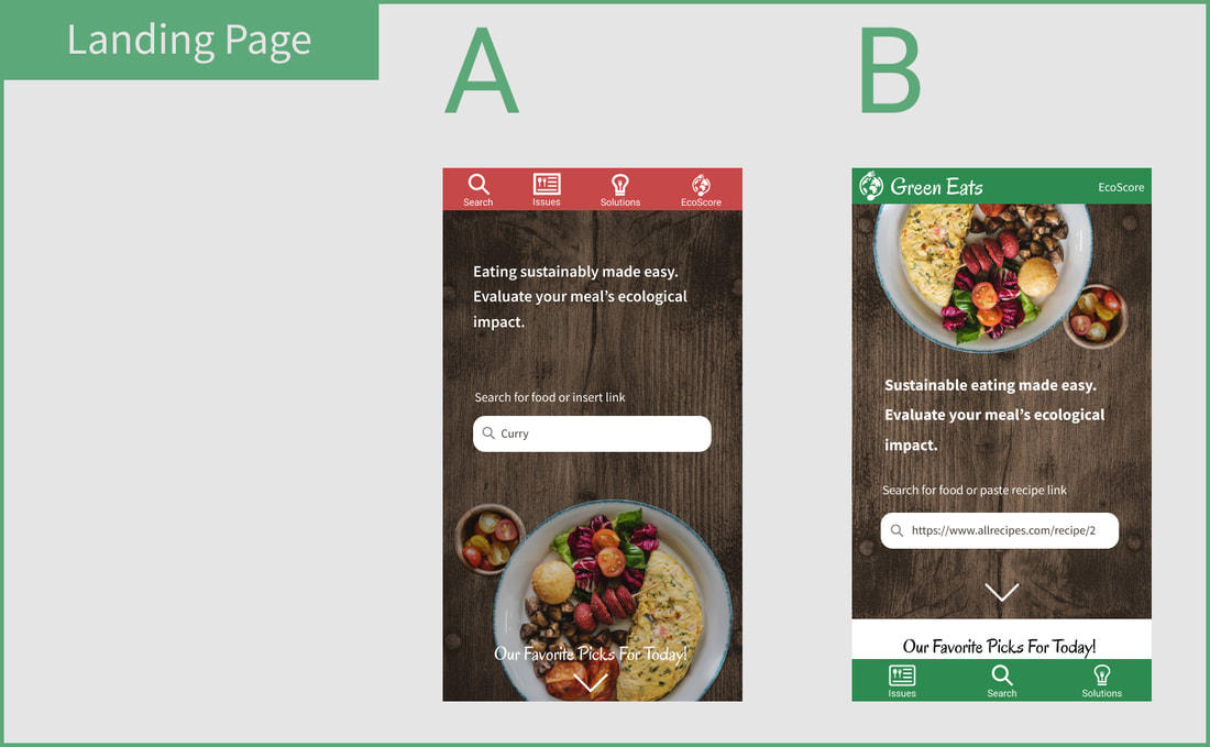
Screens used to test "Landing Page Layout"
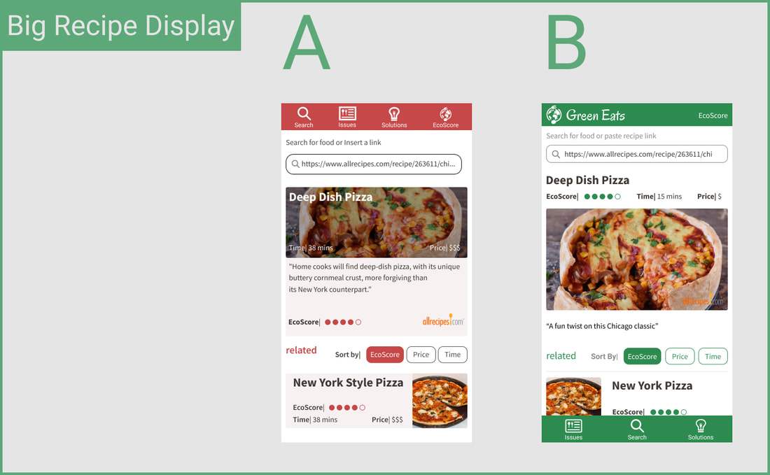
Screens used to test "Big Recipe Card Layout"
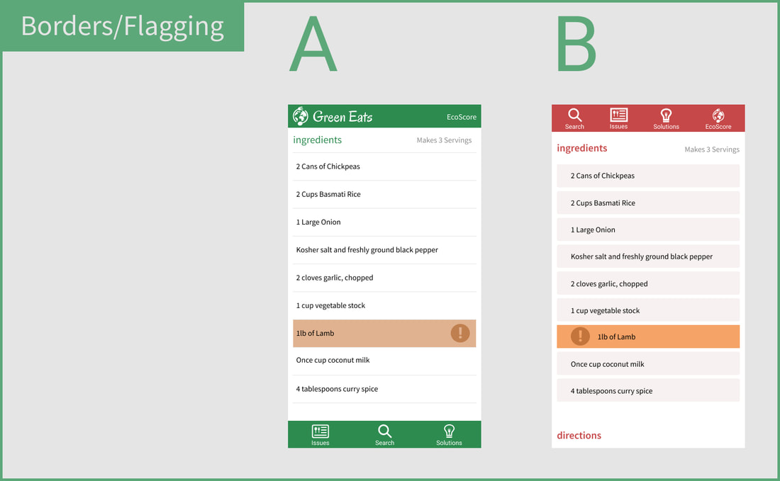
Screens used to test "Method of Ingredient Flagging" and "List Displays"
|
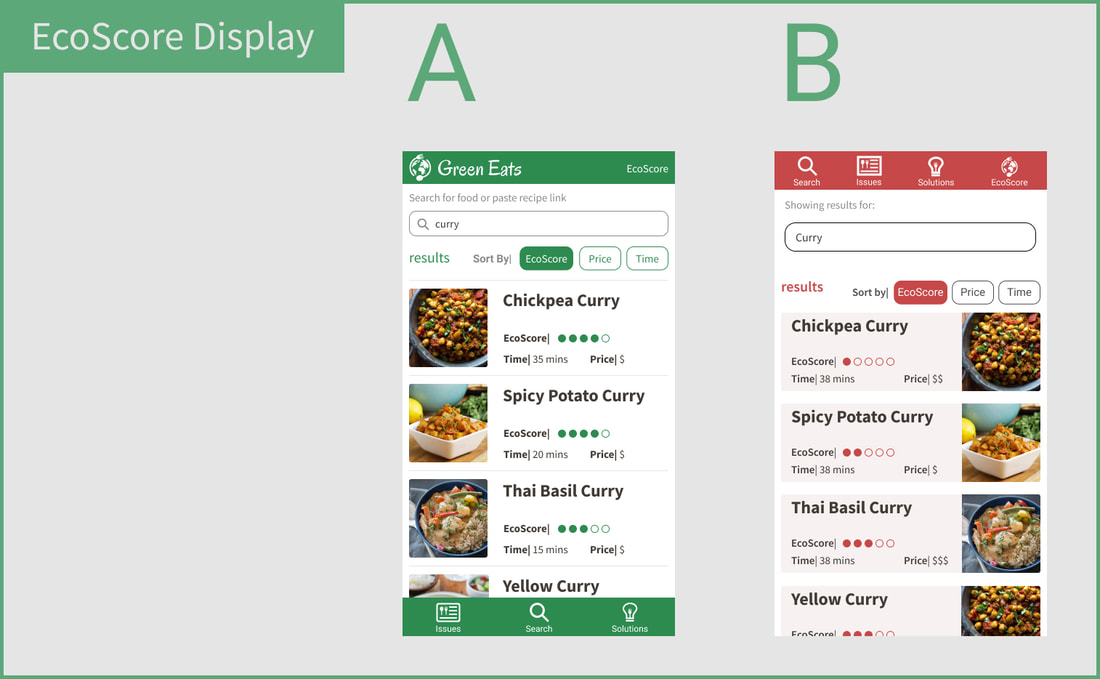
Screens used to test "EcoScore Display"
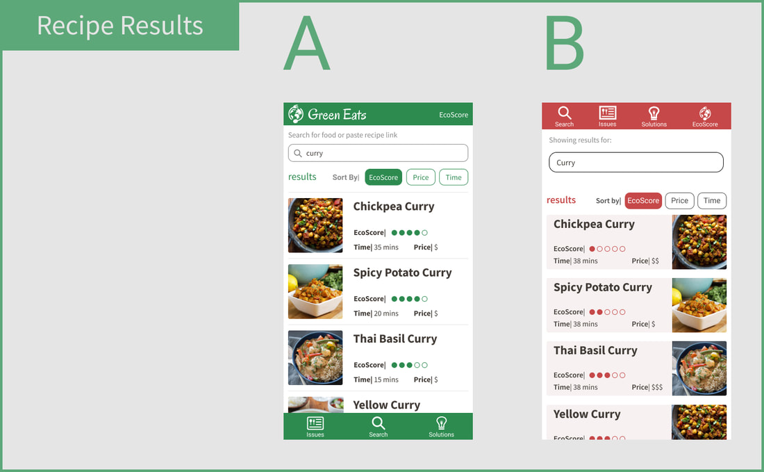
Screens used to test "Results Layout" and "List Displays"
|
Results
Listed below is a condensed summary of our findings:
Listed below is a condensed summary of our findings:
- EcoScore Display: Participants unanimously agreed that a higher EcoScore would indicate that a dish is better for the environment.
- Placement of Toolbar: Participants indicated that a toolbar located on the bottom of the screen makes it easier to interact with on a mobile platform.
- Big Recipe Card Layout: Participants preferred the big recipe display of "Version Red." It emphasizes a photo of the food, and participants stated that they like to see the food that they are making. It also felt "less cluttered" and used less screen real-estate, which allows for more results to be seen at one time.
- Method of Ingredient Flagging: Participants liked the ingredient flagging of "Version Green" and thought that "Version Red" was too jarring. We thought that displacing the text would draw more attention to the ingredient, but instead it breaks the visual language of our design. Participants said that color and iconography alone are affective at grabbing their attention.
- List Displays: Participants thought that borders around each recipe result felt crowded, and slowed down their browsing process. They indicated that browsing through results in "Version Green" felt more comfortable.
- Results Layout: Participants favored the recipe results display of "Version Green." As we learned before, users like to be able to look at the food that they are going to make. Our audience, recreational American cooks, tend to read from left to right. Placing a picture of the food to the left of the text supports a comfortable interpretation of each recipe, and places a subtle emphasis on the photo.
- Color Scheme: Participants thought that a green color scheme was ESSENTIAL (after all ,the color is in the name of our website, GREENeats). Participants also indicated that they associate the color green with "things that are good for the environment," and a green color scheme makes our website feel more eco-friendly.
What I Learned
The A/B testing that I conducted during this project was one of my first exposures to this research method. After completing the testing, I realized that we had made some mistakes. We implemented too many differences between each interface, and we should have made smaller differences to more accurately assess how one specific change to the interface affects a user's experience. As a result, a user's preference or experience with the interface could have been affected by the changes to the interface that were not related to the element we were testing. Although we got valuable feedback from these testing sessions, I learned that we could have produce more accurate results by making more minute differences between the screens we are comparing.
The A/B testing that I conducted during this project was one of my first exposures to this research method. After completing the testing, I realized that we had made some mistakes. We implemented too many differences between each interface, and we should have made smaller differences to more accurately assess how one specific change to the interface affects a user's experience. As a result, a user's preference or experience with the interface could have been affected by the changes to the interface that were not related to the element we were testing. Although we got valuable feedback from these testing sessions, I learned that we could have produce more accurate results by making more minute differences between the screens we are comparing.
Heat Map Testing
After concluding the A/B testing sessions, I informed my teammate of my findings. We deliberated how the results of our testing sessions could be incorporated into our interface, and we revised our UI to reflect the preferences of our participants. However, I wanted to understand the impact these changes had on our users. We decided to perform heat map testing on our new interface in order to assess how the changes affected the usability of our product. I helped my teammate create three scenarios for our participants to complete by using our interface. We recruited 10 participants to take part in our heat map testing sessions. After completing our testing, we compiled the results and evaluated our data based off of three metrics:
- Success or failure of task, indicated by the pie chart
- Amount of time spent on task, indicated by the blue bar
- Amount and location of clicks on each screen, indicated by the blue and red hues on each screen
Scenario 1
You are making a Chickpea Curry for dinner and you are interested in minimizing its ecological impacts. Find a Chickpea Curry recipe and modify its ingredients to reduce your personal carbon footprint.
You are making a Chickpea Curry for dinner and you are interested in minimizing its ecological impacts. Find a Chickpea Curry recipe and modify its ingredients to reduce your personal carbon footprint.
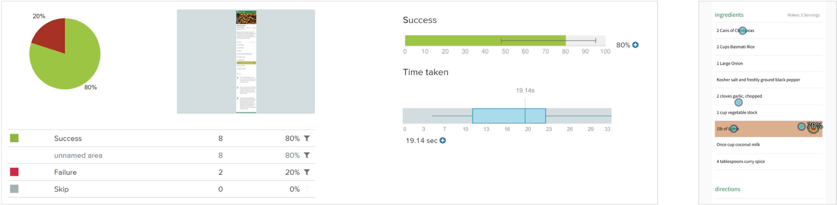
Graphical representation of the results from 10 participants walking through Scenario 1
|
Takeaway
- Modify the alert color to be more red to catch the user’s eye and convey a sense of urgency in a more familiar way.
Scenario 2
You slept in and have less time to prepare lunch for the day. Having watched Food Inc. the night before, you want make a sustainable meal. Show me how you would go about finding recipes that meet your needs.interested in minimizing its ecological impacts.
You slept in and have less time to prepare lunch for the day. Having watched Food Inc. the night before, you want make a sustainable meal. Show me how you would go about finding recipes that meet your needs.interested in minimizing its ecological impacts.
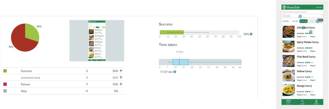
Graphical representation of the results from 10 participants walking through Scenario 2
|
Takeaway
- Scenario was poorly worded and motivated people to click "search" rather than utilize the sorting feature. Of the people who used the sorting features, most clicked on the correct button. No modifications needed.
Scenario 3
You are new to sustainable eating and want to learn more about the context of this movement. Find a recent news article that addresses climate change and/or sustainable eating.
You are new to sustainable eating and want to learn more about the context of this movement. Find a recent news article that addresses climate change and/or sustainable eating.
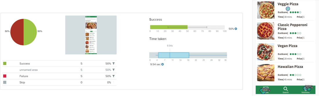
Graphical representation of the results from 10 participants walking through Scenario 3
|
Takeaway
- There was confusion about whether or not context could be found under the “Issues” tab or the “Solutions” tab. Rename “Solutions” to “EcoTips” to create more of a distinction.
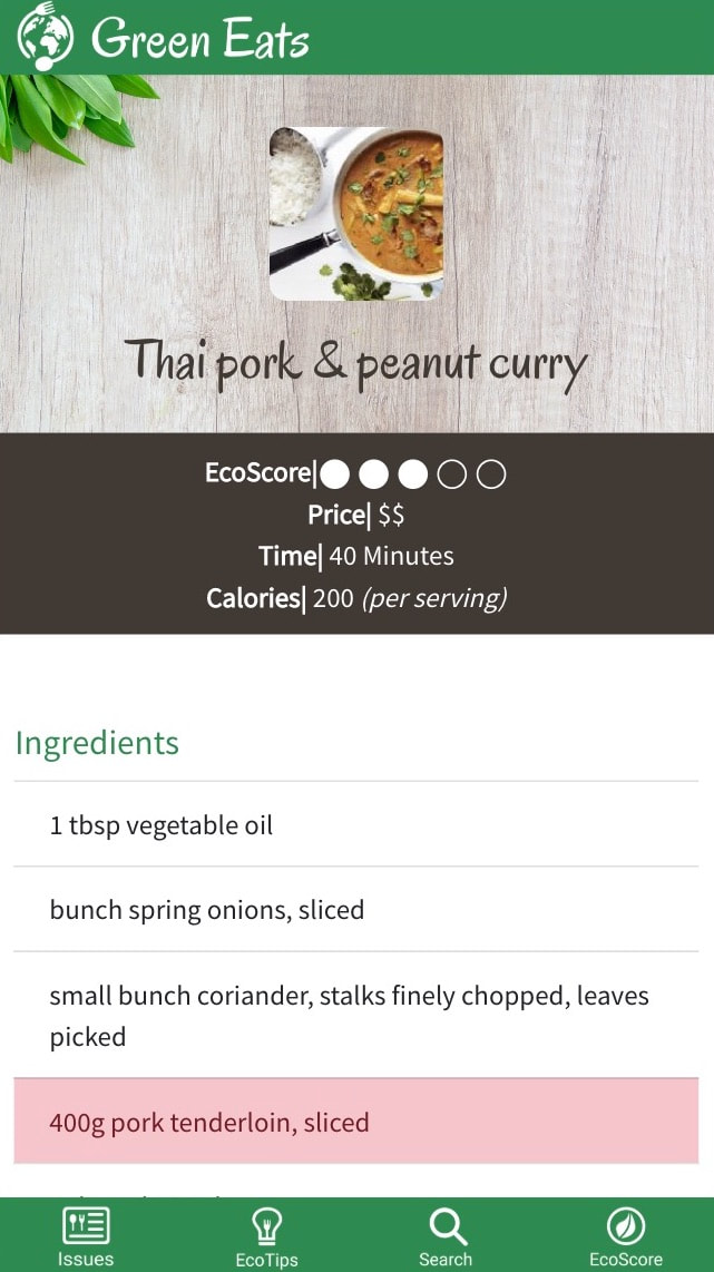
Final Mobile Mockups
We learned from our heat map tests how we could make our user interface more comprehensible to users. My teammate and I used what we learned from our testing sessions to create a final high fidelity mockup of our mobile interface. Our iterative design process allowed us to make a UI that effectively meets the needs of our audience, and offers an elegant solution to the problem that we identified in our initial research. We created an interactive prototype with these mockups that we used to guide us through our coding process.
Our final high-fidelity mobile interface mockups. These were referenced during coding to create the mobile website.
|
|
|
Implementation |
|
My Role
I was the primary web developer during the implementation phase of this project. I wrote the majority of the React.js and HTML/CSS code that give our website it's logic and functionality, including page navigation, recipe search function, recipe generation, ingredient generation, ingredient substitution, and API use. I collaborated with my teammate to write the CSS that stylized our website to look and behave like our mockups. I also assisted with creating the media queries to make our website responsive. Over the course of implementation, I translated our mobile-based interface to a web-based interface, and made sure that the visual language of our product was consistent between both platforms.
Responsive Web Coding
I used React.js and HTML/CSS to code the GreenEats website. Our main focus throughout the development process was to create a website that could easily transition between mobile, tablet, and desktop browsers. To accomplish this my teammate and I implemented media queries - snippets of CSS code that change the CSS of a website based off of the width of the viewport. I called upon the Spoonacular API to create the recipe searching functionality, and I learned how to incorporate an API into React.js code. I also used react-bootstrap to develop the functionality of our website, which gave me a lot of experience with navigating and interpreting the documentation of libraries that I was new too. This was my first experience with web development, and as expected I ran into a lot of challenges.
One of the biggest challenges was understanding how to pass variables properly, both within a single .js file (between multiple functions) and between different React components. I used the setState function to assign the response of Spoonacular API as a state of the component I was working in. The setState function was difficult to work with at times, because I was trying to call it within the render function. The setState function re-runs the render function so calling setState within the render function will result in an infinite loop. To work around this, I ended up creating a number of flags that were changed when the API was being called.
I also struggled with making the algorithm that calculates the ecoScore of each recipe. I found it almost impossible to figure out how to make a component return a string or a variable (in react, saying var result = <Component> will instead return an object). To tackle this issue, I ended up combining the provider component (I know now that it should have been a class) and the component that needed to reference the returned value. I know it resulted in “sloppy code”, but I was able to achieve my goal in combining these two .js files.
From Mobile to Desktop
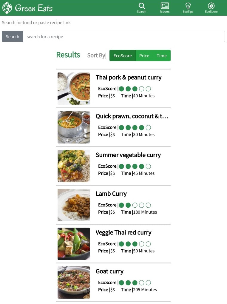
A big challenge we faced while coding our website was writing the CSS that translated our mobile interface to a web-based interface. Not only did I have write hundreds of line of code , but I also had to make small adjustments to our interface that supported the user's platform. For example, in our mobile and tablet interfaces, the toolbar is located at the bottom as it is much easier to reach with a thumb. In our desktop interface, we placed the toolbar on top, as users are more familiar with desktop navigation bars to be on the top of the screen. My teammate and I made sure to tailor each interface to best meet the needs and expectations that come with each platform. The photos shown below are a few examples of the responsiveness of our website, and demonstrate how the interface (and experience) changes with the dimensions of the viewport.
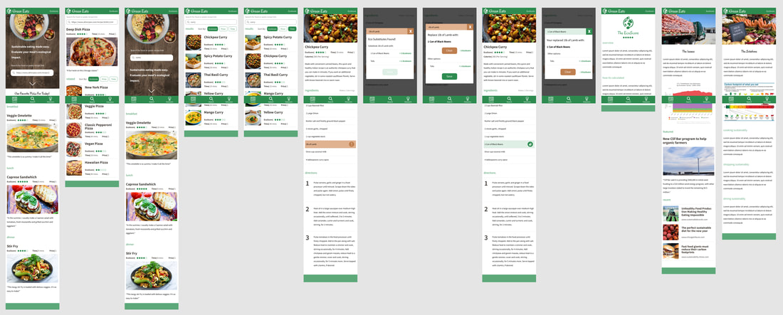
Landing Page
Mobile View
|
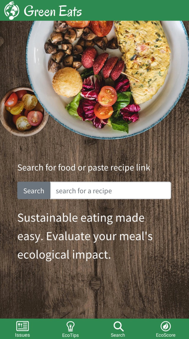
Tablet View
|
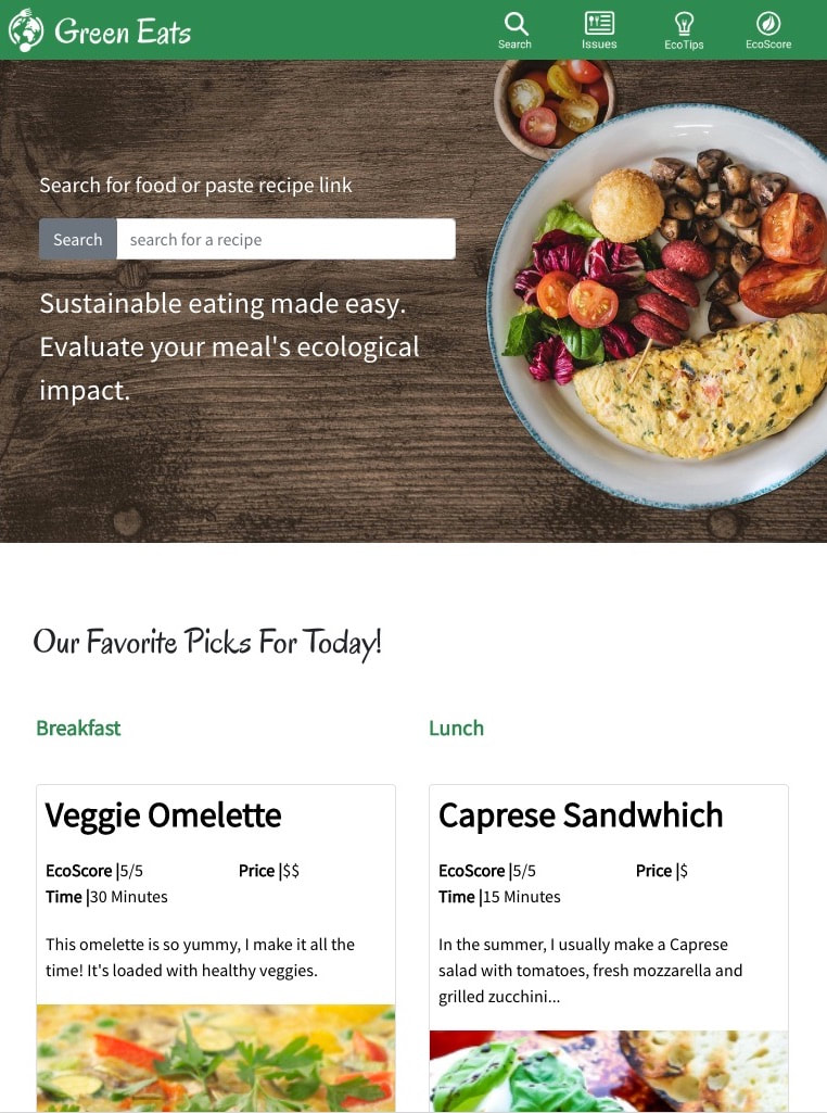
Web View
|
Search Results
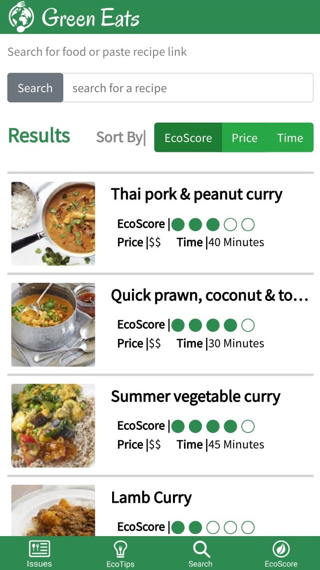
Mobile View
|
Tablet View
|
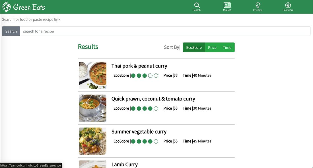
Desktop View
|
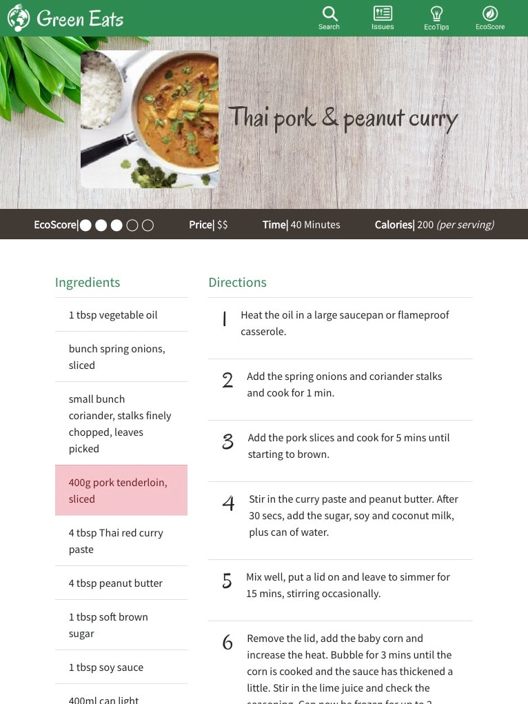
Recipe Page
Mobile View
|
Tablet View
|
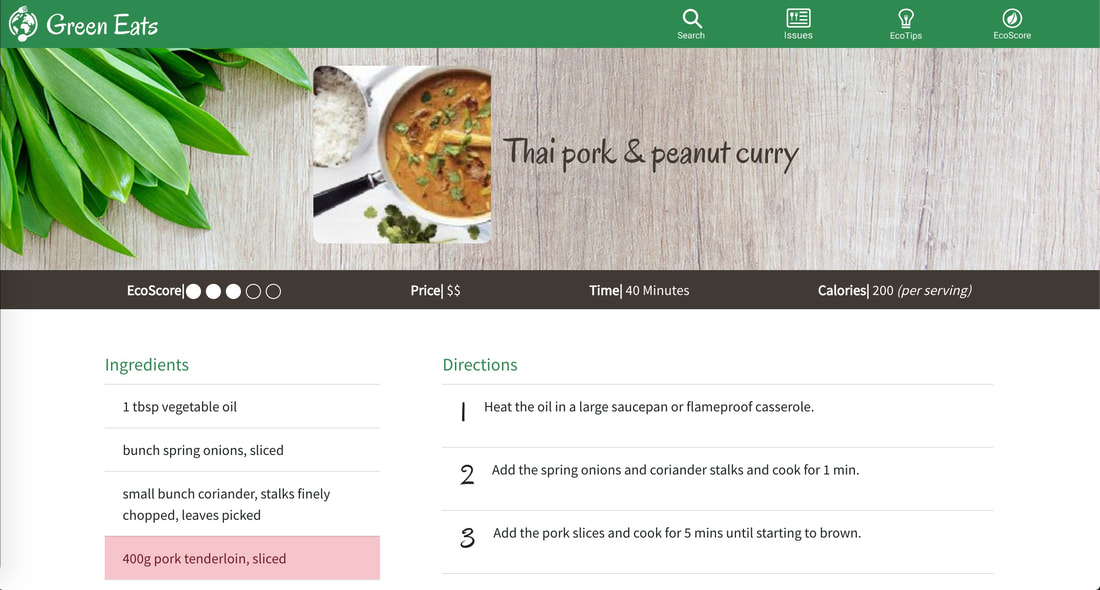
Desktop View
|
|
|
Reflection |
|
I am very satisfied with the work that my teammate and I did on GreenEats. This project allowed me to diversify my skillset, and I feel like I grew as a designer. Not only did I gain more experience with mobile and web design, but I learned how to write the code to take my designs to the web. Even if I wont pursue web development as a career path, the skills that I learned from coding GreenEats make me more able to communicate with development teams. I also learned the limitations of web development, which allows me to create effective yet achievable interfaces for development teams. I now have a great understanding of the entire lifecycle of project, starting from research and ending with publishing a website. I am indebted to my teammate, Nikita Kovalovs, who helped me grow both as a designer and as a human being. I am also indebted to the team of three individuals who taught me everything I know about web development, and gave me the confidence to start doing independent web development.
